Griddy Blocks: A Practical Evaluation of Modular Grid-Based Design Components
When you work regularly with layout design, one recurring challenge is balancing consistency with creative flexibility. Griddy Blocks addresses this directly by offering a structured system of modular, grid-aligned components designed for digital projects. Rather than being a rigid template library or a full-blown design framework, Griddy Blocks sits somewhere between a component toolkit and a structural guide. This article offers a grounded, experience-based look at what Griddy Blocks provides, how it performs in real-world use, and who is most likely to benefit from building with it.
What Griddy Blocks Actually Is
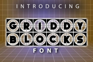
Griddy Blocks is a collection of pre-built, grid-based layout blocks intended for use in web design, UI prototyping, content presentations, and similar visual projects. Each block follows a consistent grid logic, meaning alignment, spacing, and proportion are handled systematically. The blocks themselves are not tied to any specific platform or code language, making them adaptable to workflows ranging from HTML and CSS to Figma, Sketch, or even print layouts.
The core idea is straightforward: instead of building every section from scratch or relying on a full design system with heavy opinionation, you get a set of modular pieces that fit together on a shared grid. This approach reduces the mental overhead of spacing and alignment decisions while still allowing for variation in color, imagery, typography, and content hierarchy. Griddy Blocks is not a theme, not a plugin, and not a page builder — it is a component library built on grid principles.
Key Characteristics and Structural Strengths
One of the first things you notice when working with Griddy Blocks is the level of attention given to proportion. Each block is designed with ratios that feel balanced without requiring manual tweaking. This is particularly valuable when you need to produce multiple sections that look cohesive but not repetitive. The blocks come in several categories, including headers, feature sections, content grids, call-to-action areas, and footer layouts. Within each category, there are multiple variations that share the same underlying grid anatomy.
Another defining characteristic is the absence of heavy styling. Griddy Blocks provides structure — spacing, alignment, column relationships — but leaves surface styling largely up to you. This is a deliberate choice. It means you are not inheriting someone else’s aesthetic preferences. You bring your own colors, fonts, images, and branding. What you get is a reliable skeleton that makes those design decisions look intentional and professionally spaced.
Consistency across different block types is also strong. Because all blocks share a common grid reference, mixing and matching them does not produce jarring shifts in margins, padding, or element relationships. This is harder to achieve than it sounds, and it is one of the areas where Griddy Blocks shows genuine design maturity.
Real-World Usability and Workflow Integration
In practice, Griddy Blocks works well for projects where speed and visual coherence are both priorities. For example, if you are building a landing page for a product launch and need to produce multiple sections quickly, the blocks give you a starting point that already handles spacing and alignment. You can focus on content selection, imagery, and messaging rather than on whether the left column is 12 pixels off from the right column.
Integration into existing workflows is straightforward. Because the blocks are not tied to a specific editor or framework, you can import them into Figma or Sketch as symbol libraries, use them as CSS grid templates, or treat them as layout references for hand-coding. This flexibility is a genuine advantage for teams that work across different tools or for freelancers who switch between projects with different tech stacks.
One limitation worth noting is that Griddy Blocks does not include responsive variations out of the box. The blocks assume a desktop or tablet grid. If you need mobile-specific breakpoints or complex responsive behaviors, you will need to adapt the blocks yourself. This is not a dealbreaker for most experienced designers, but it does mean that beginners or those looking for a fully automated responsive solution may need to invest additional effort.
Quality, Reliability, and Long-Term Value
The build quality of Griddy Blocks is solid. The blocks are well-organized, consistently named, and documented in a way that is clear without being verbose. Each block includes notes on its intended use, grid parameters, and suggested content sizes. This kind of documentation is often overlooked in component libraries, but here it is handled well.
Long-term value depends on how you use it. If you treat Griddy Blocks as a one-off template set, its usefulness will fade after the first project. However, if you treat it as a structural foundation that you can extend, modify, and build your own variations upon, it becomes a durable part of your workflow. Many experienced designers find that once they internalize the grid logic used in Griddy Blocks, they start creating their own custom blocks that follow the same principles. That is a strong signal of a well-designed system.
Regarding reliability, the blocks have been tested across common scenarios like content-heavy pages, marketing sites, portfolio layouts, and informational landing pages. They hold up well under realistic content loads. The grid remains stable even when you swap in longer headlines, larger images, or varying amounts of body copy.
Who Benefits Most from Griddy Blocks
Professionals working on branded content presentations will find Griddy Blocks particularly useful. This includes marketing teams producing campaign pages, content creators building consistent article layouts, and small business owners managing their own websites without a dedicated design team. The blocks remove a significant layer of guesswork around layout structure, which frees up mental energy for content and messaging.
Freelancers and independent designers also benefit. When you are juggling multiple client projects with different visual identities, having a neutral structural system that works across all of them is a practical advantage. You are not learning a new system for each client. Instead, you are applying the same grid logic with different surface treatments. This speeds up your workflow and reduces the risk of structural inconsistencies between projects.
Educators teaching layout principles may also find Griddy Blocks useful as a teaching tool. The blocks demonstrate how consistent grid thinking produces visually coherent results. Students can study the relationship between block types, understand why spacing works the way it does, and then experiment by creating their own variations. The blocks serve as both a reference and a starting point for learning.
Possible Limitations and Considerations
No tool is without trade-offs, and Griddy Blocks has a few. The most notable is the lack of built-in responsive behavior. As mentioned, you will need to handle breakpoints and mobile adaptations yourself. For designers comfortable with CSS media queries or Figma constraints, this is a manageable task. For those who expect a set-it-and-forget-it solution, it may feel incomplete.
Another limitation is that the blocks are intentionally minimal in styling. If you prefer working with fully styled, ready-to-publish components, Griddy Blocks may feel too bare. It requires you to bring your own design language, which is a strength for some and a drawback for others. Knowing your own preference ahead of time helps determine whether this system fits your workflow.
Finally, while the documentation is solid, there is no extensive tutorial library or community forum supporting Griddy Blocks. You are expected to understand basic layout and grid concepts. For experienced designers, this is fine. For absolute beginners, it may require some additional learning before the blocks become truly useful.
Practical Recommendations for Getting Started
If you decide to work with Griddy Blocks, start small. Pick two or three block types that match a common layout need you have — such as a feature grid and a content section — and build a single page with them. Observe where the grid logic helps you and where you feel constrained. Then adjust. The blocks are designed to be modified, so do not hesitate to change spacing, column widths, or block heights to match your specific content.
It also helps to define your visual language before you begin importing blocks. Having your color palette, typography scale, and image treatment guidelines ready means you can apply them immediately to the block structures. This combination of structured layout plus your own styling produces results that look both professional and original.
For teams, establishing a shared block library based on Griddy Blocks can create consistency across multiple projects without enforcing a single visual identity. Each project can apply its own branding while benefiting from the same underlying grid logic. This is one of the most practical long-term uses of the system.
Final Observations
Griddy Blocks is not a revolutionary design tool, and it does not claim to be. What it offers is something arguably more useful in day-to-day work: a reliable, well-considered structural foundation that reduces repetitive decisions without dictating aesthetics. For designers, marketers, and content professionals who value consistency and efficiency, it is a practical addition to the toolkit. Its value becomes most apparent not in the first project, but in the fifth or tenth, when you realize how many small alignment decisions it has eliminated from your workflow. That is the kind of tool that earns its place.